
Richard Phillips
BRANDING & VISUAL IDENTITY
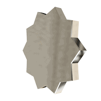
Richard Phillips enlisted La De La to modernise the company's visual identity and overall brand, a legacy originally created by the legendary design pairing Wolff Olins three decades ago. This iconic identity has endured with its self-assured silver colour palette, distinctive white circle, and an enduring air of mystery surrounding the enigmatic Richard Phillips.
Richard Phillips himself is a leading authority and mentor in the realm of personal communication, guiding top-tier executives and international leaders to become dynamic and effective communicators. After serving as the sole coach in the company for many years, he has now welcomed a new expert, Dora Mallinson, to the team. The addition of Dora has meant there must be clear communication about the team's composition and the services they offer.
Through close collaboration with the Richard Phillips Ltd team, it became evident what elements of the original brand should be preserved and what enhancements should be introduced. The silver colour palette and white circle, familiar to Richard's existing clientele, were retained. Dora's presence would be integrated into the website and presentation materials to showcase her specific expertise.
To provide a more humanistic touch, photography was introduced to the branding - something not used before. In line with the company's high-profile status, a deliberate decision was made to maintain an air of mystery by revealing minimal information through photography, allowing potential clients to engage their imagination and preserving Richard's aura of mystique.
To provide a more humanistic touch, photography was introduced to the branding - something not used before. In line with the company's high-profile status, a deliberate decision was made to maintain an air of mystery by revealing minimal information through photography, allowing potential clients to engage their imagination and preserving Richard's aura of mystique.
CLIENT
Richard Phillips
DATE
2023
Richard Phillips
BRANDING &
VISUAL IDENTITY
CLIENT
Richard Phillips
DATE
2023
Richard Phillips enlisted La De La to modernise the company's visual identity and overall brand, a legacy originally created by the legendary design pairing Wolff Olins three decades ago. This iconic identity has endured with its self-assured silver colour palette, distinctive white circle, and an enduring air of mystery surrounding the enigmatic Richard Phillips.
Richard Phillips himself is a leading authority and mentor in the realm of personal communication, guiding top-tier executives and international leaders to become dynamic and effective communicators. After serving as the sole coach in the company for many years, he has now welcomed a new expert, Dora Mallinson, to the team. The addition of Dora has meant there must be clear communication about the team's composition and the services they offer.
Through close collaboration with the Richard Phillips Ltd team, it became evident what elements of the original brand should be preserved and what enhancements should be introduced. The silver colour palette and white circle, familiar to Richard's existing clientele, were retained. Dora's presence would be integrated into the website and presentation materials to showcase her specific expertise.
To provide a more humanistic touch, photography was introduced to the branding - something not used before. In line with the company's high-profile status, a deliberate decision was made to maintain an air of mystery by revealing minimal information through photography, allowing potential clients to engage their imagination and preserving Richard's aura of mystique.


Design & Art Direction
Kieran Rid
Design & Art Direction
Kieran Rid
Design & Art Direction
Kieran Rid
Kieran Rid
Website Visualiser
Corey Rid
Website Visualiser
Corey Rid
Website Visualiser
Corey Rid
Corey Rid
Studio Photography
Barley Nimmo
Studio Photography
Barley Nimmo
Studio Photography
Barley Nimmo
Barley Nimmo
Web Developer
Trebel Scott
Web Developer
Trebel Scott
Web Developer
Trebel Scott
Trebel Scott
All Other Photography
Kieran Rid
All Other Photography
Kieran Rid
All Other Photography
Kieran Rid
Kieran Rid
Design & Art Direction
Kieran Rid
Design & Art Direction
Kieran Rid
Design & Art Direction
Kieran Rid
Kieran Rid
Website Visualiser
Corey Rid
Website Visualiser
Corey Rid
Website Visualiser
Corey Rid
Corey Rid
Studio Photography
Barley Nimmo
Studio Photography
Barley Nimmo
Studio Photography
Barley Nimmo
Barley Nimmo
Web Developer
Trebel Scott
Web Developer
Trebel Scott
Web Developer
Trebel Scott
Web Developer
Trebel Scott
Web Developer
Trebel Scott
Web Developer
Trebel Scott
Trebel Scott
All Other Photography
Kieran Rid
All Other Photography
Kieran Rid
All Other Photography
Kieran Rid
All Other Photography
Kieran Rid
All Other Photography
Kieran Rid
All Other Photography
Kieran Rid
Kieran Rid