
POP Cycling Co.
BRANDING
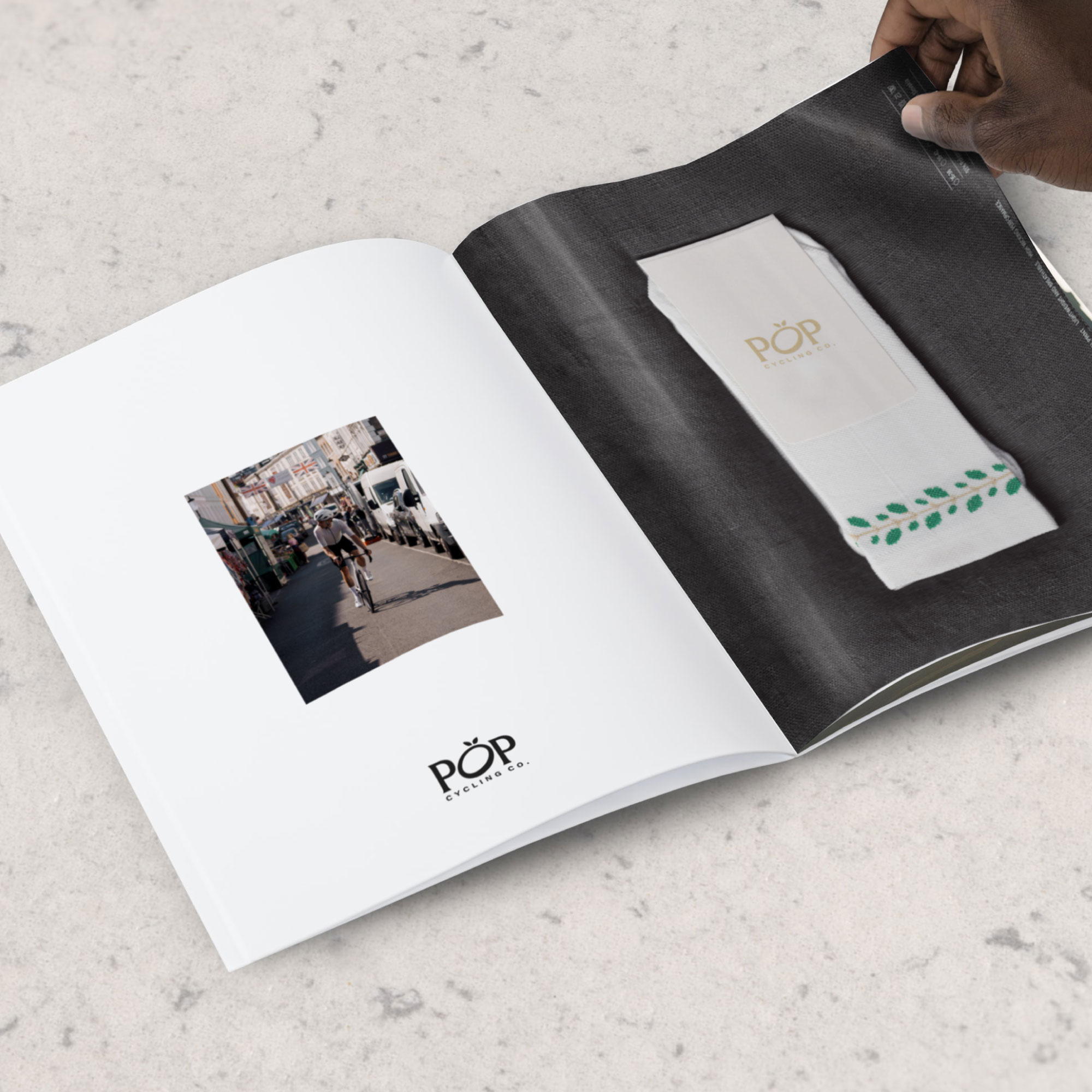
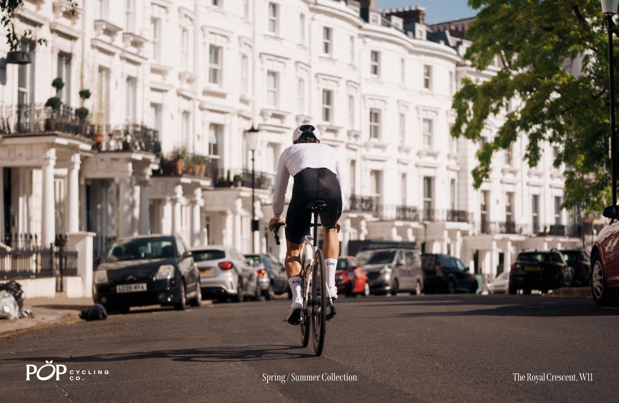
POP Cycling Co. is an independent fashion brand hailing from the vibrant neighbourhood of Notting Hill, London. Deeply ingrained in every facet of West London life, from coffee shops to bustling market stalls.
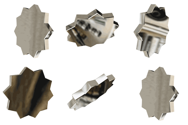
The iconic orange emblem, a nod to its origins, finds inspiration in the latter, encapsulating the spirit of POP Cycling Co.
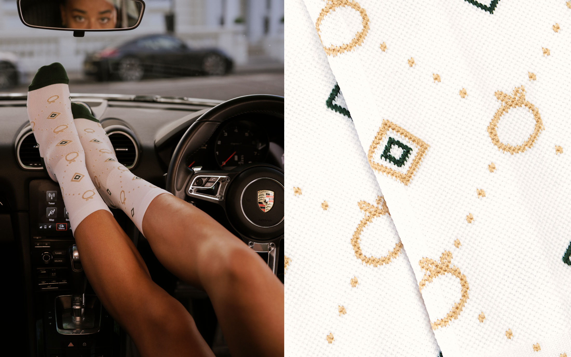
Seamlessly fusing high fashion with cycling garments and accessories, POP has a fast growing, international fan base. Our work with POP Cycling Co. has covered all aspects of the brand, starting with an initial brand strategy, visual identity design, defining the brand's tone of voice, right through to product design.
CLIENT
POP Cycing Co.
DATE
2022 - Present
POP Cycling Co.
BRANDING
DATE
2022 – Present
POP Cycling Co. is an independent fashion brand hailing from the vibrant neighbourhood of Notting Hill, London.
Deeply ingrained in every facet of West London life, from coffee shops to bustling market stalls. The iconic orange emblem, a nod to its origins, finds inspiration in the latter, encapsulating the spirit of POP Cycling Co.
Seamlessly fusing high fashion with cycling garments and accessories, POP has a fast growing, international fan base. Our work with POP Cycling Co. has covered all aspects of the brand, starting with an initial brand strategy, visual identity design, defining the brand's tone of voice, right through to product design.